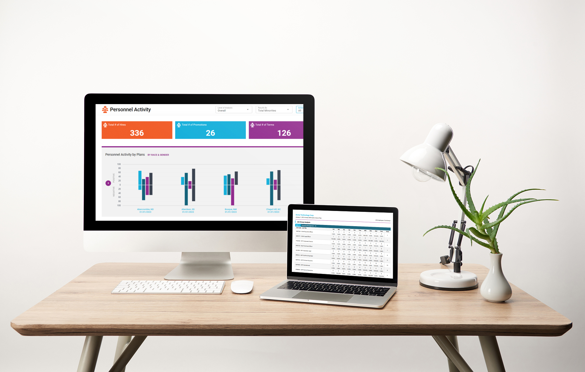
Our new data visualizations for your AAP provide so much more than a traditional dashboard!
Easy to interpret graphs and charts will present your data in a way that everyone can understand. Rather than comb through countless PDFs to try to piece together how well your organization is performing, you get a rich executive summary of status and progress using visually appealing, user-friendly charts and graphs.
In the BCP, you can view big picture results while being able to dive deep into problems that require a closer look. Clients with multiple plans can easily view their results in a variety of ways, combining different plans across locations or business lines, or by focusing on one establishment or plan.
And the BCP is user friendly, easy to navigate and use for users with any level of expertise. Results are intended to be understandable by the novice or the expert.
Better yet, the new data visualization makes it easy to share information with key stakeholders in your organization. The newly-designed downloadable reports – with layouts created with feedback from industry experts - make it easy to present your data to others in your company. And BCP makes it easy to know what to share with what audience, as summaries are available at multiple levels allowing you to target the communication of results to a variety of audiences.
-1.png "HR Compliance Consulting Firm")


.png?width=593&name=MicrosoftTeams-image%20(4).png "MicrosoftTeams-image (4)")